We love seeing the unique designs uploaded by customers, but sometimes artwork can miss the mark. Here are five common mistakes and how you can prevent them to ensure the best print quality!
Low Resolution Files - A blurry print is never ideal. To ensure your artwork looks sharp, we require a minimum resolution of 150 dpi (dots per inch), but we recommend 300 dpi for the best results. The higher the resolution, the better the print! Often, artwork is saved at a high resolution at a small size, but when scaled for printing, it loses quality. To avoid this, make sure your artwork is saved at a size of 10–12 inches to maintain its resolution and clarity.
Please note, the high-resolution doesn’t always equal high-quality appearance—so we recommend checking both the DPI and the visual sharpness of your artwork before submitting it for print.
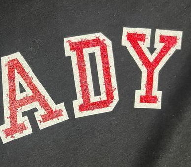
Line Weight Minimums - For most decoration methods, all lines should be at least 1 point thick to ensure clean, sharp printing. Textured products, such as hats, towels, or fleece, require even thicker lines to adhere properly. Additionally, negative spaces must be at least 2 points thick, as anything thinner may cause prints to blur or merge. You can check your line weights using design software like Adobe. If needed, our design team is also available to assist with graphic editing or a store audit.
Transparencies in Direct-To-Film Artwork - All Direct-To-Film designs are printed with a solid white underbase. This causes any transparent parts of your design to be printed as an opaque object. To avoid this mistake, consider switching your decoration method to Direct-To-Garment or removing the transparent part of the design.
Color Bleed with Direct-To-Garment - With Direct-To-Garment, your product is printed with ink applied directly to the product, similar to a household printer printing on paper. Large shapes printed with solid color will create a heavy deposit of ink that may bleed into nearby objects. To avoid this mistake, make sure your negative spaces are at least 2 points thick. You can also reach out to us at info@printyourcause.com and request a printing pause be added to your file. A printing pause will allow the ink more time to dry which prevents the colors from bleeding.

Low Contrast Design - When choosing your product colors, consider the colors in the design. Printing the same color design onto the same color shirt will make the design fade into the shirt and it will be very hard to see. To avoid this, choose product colors that contrast well with the design. For example, for a black design, consider printing on a light color shirt. You can also change the color of your design so you can offer a wider variety of product colors.
Our goal is to help you maximize the impact of your designs and ensure they meet the highest quality standards for production. However, please be aware that we are unable to replace items created using low-quality artwork. By adhering to these guidelines, you'll create designs that not only look great but also meet our production standards. For any additional assistance, feel free to reach out to our support team.
Not sure about your artwork? Reach out to us at info@printyourcause.com to request a Design Audit or help with your graphics!